Ronin Cooking LLC

The Story
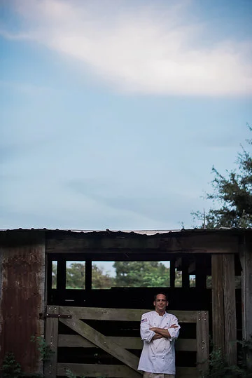
For local farm-to-table gurus, Ronin Cooking, we updated their entire brand identity. After meeting with them, we landed on a few words to get us started.
We worked together for a few weeks to develop an inspiration board on Pinterest. After the first round, the chef Brian (who had been skeptical) said, "I trust you completely." That’s a great day.
The Inspiration
organic, homesteading, juxtaposition

The Results
I developed a seasonal color palette of blues & greens. And chose a rustic font and a modern sans serif to mimic the feel of their cuisine — a mix of upscale food in a rustic setting. I also recommended putting emphasis on just RONIN and smaller “cooking” allowing for expansion of their offerings down the road. RONIN weddings. RONIN catering, etc.
For business cards, we worked with moo printing. This allowed them to have a variety of visuals on their card. This was strategic so they could have small runs and target the various markets, from catering to weddings, depending on where they were handing them out.

Menus needed to be produced in-house. We ordered some stickers (again through MOO) to allow the rustic paper to be printed with simple black ink and added a bit of professional gloss & color with the label at the top.

The website was designed using Squarespace and launched in Fall of 2015. We redeveloped written & visual content to allow for expansion of their offerings. They were currently strong in the catering market & developing the venue hosting elements for events & weddings. Note, after years of unprecedented expansion — and a new hosting contract — they have since updated their website design. A screenshot of my original design is located here.

Deliverables for social media such as Instagram, Facebook and Eventbrite were also developed in layers for quick & easy monthly updates. They use student volunteers for some of their operations, so ease-of-use and minimal training were priorities.


Featured Photography